Most A/B tests take weeks to run and months to plan. What if you could preview the likely winner before you ship?
We tested this idea by taking three real A/B tests from Blinkist, Uber, and Stash, all with published outcomes, and running them through vcrowd's virtual focus group, blind. The panel had no idea which company, product, or market it was looking at. It saw two designs and one question: "Which version drives higher [metric]? By how much?"
In all three cases, the panel picked the correct winner. And in all three, its estimated lift landed within the range of the actual result. That's a small sample (three tests, not three hundred) but it's enough to show what this approach can do for product and growth teams looking to prioritize experiments before committing engineering time.
How the test worked
Each case followed the same process:
- Two screenshots of a published A/B test were loaded into vcrowd, one for each variant.
- A panel of 20 AI-generated virtual respondents was created with diverse demographic and psychographic profiles. These are not real people. They are simulated personas powered by large language models.
- Each respondent evaluated the two designs blind and predicted which would perform better on the specified metric, along with a percentage estimate.
- Responses were aggregated into a consensus prediction with a distribution of estimates.
The panel saw no brand names, no company context, and no hints about which version was the original. Below are the three cases and how the panel's predictions compared to the actual published outcomes.
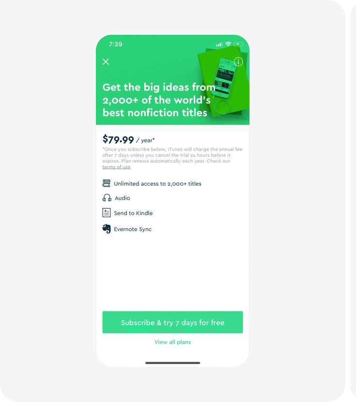
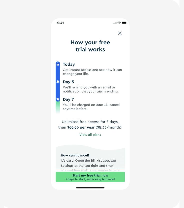
Case 1: Blinkist, Free Trial Transparency
Metric: trial sign-up conversion rate
Blinkist redesigned their free trial screen. Version A led with a value proposition. Version B added a step-by-step breakdown of the trial: what happens on Day 1, Day 5 (reminder), and Day 7 (charge), plus a prominent "super easy to cancel" message.
What the panel predicted
All 20 respondents unanimously picked Version B. The predicted uplift clustered tightly:
| Prediction tier | Respondents | Estimated lift |
|---|---|---|
| High | 10 (50%) | 20–25% |
| Moderate | 8 (40%) | 12–19% |
| Conservative | 2 (10%) | Under 12% |
Actual result
| Metric | Panel predicted | Actual outcome |
|---|---|---|
| Winner | B | B |
| Lift | 20–25% | 23% |
The majority estimate of 20–25% landed directly on the actual 23% lift.
"Image B directly mitigates the user's fear of loss and commitment aversion by clearly outlining the trial's mechanics and, crucially, making cancellation seem effortless." — Dr. Eleanor Vance, 58, AI-generated panelist
What the panel spotted: Users are willing to pay a higher annual price if they trust they can leave easily. Making cancellation prominent isn't a compliance detail, it's a conversion lever. A team considering this change could have used vcrowd to validate the direction before running a multi-week live experiment.
View original case on abtest.design · Source
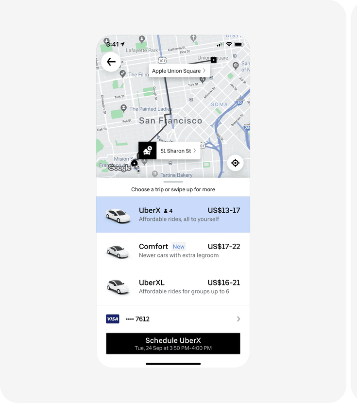
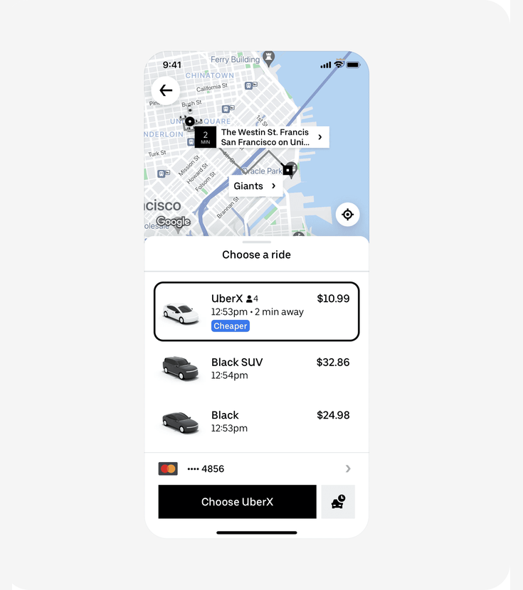
Case 2: Uber, Clearer Pricing Estimate
Metric: rides per user
Uber tested replacing ambiguous price ranges ("$14–18") with a single upfront fare, a "Cheaper" comparison tag, and an immediate ETA.
What the panel predicted
95% of respondents (19 out of 20) picked Version B, estimating a 6–20% uplift clustering around 10–15%.
| Prediction tier | Respondents | Estimated lift |
|---|---|---|
| Immediate conversion focus (Version B) | 19 (95%) | 10–15% typical |
| Long-term habit focus (Version A) | 1 (5%) | — |
Actual result
| Metric | Panel predicted | Actual outcome |
|---|---|---|
| Winner | B | B |
| Lift | 10–15% | ~15% |
The consensus estimate matched the actual result almost exactly.
"The clarity and certainty it offers, specifically highlighting the option as 'Cheaper' and providing a precise price with immediate availability, significantly reduces the cognitive effort required to make a decision." — Dr. Lena Svensson, 55, AI-generated panelist
What the panel spotted: Price ranges force users to do math and create doubt. A single number with a comparison label ("Cheaper") turns a complex evaluation into a simple yes/no. If Uber's product team had tested this direction with vcrowd first, they'd have seen strong consensus before committing to a full rollout.
View original case on abtest.design · Source
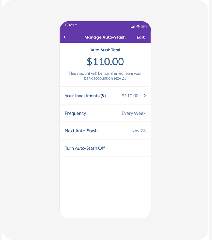
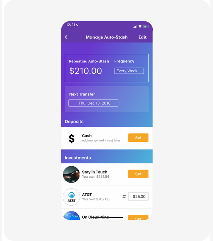
Case 3: Stash, Individual Investment Amounts
Metric: long-term savings retention rate
Stash tested whether showing individual investment breakdowns (per-stock amounts) instead of just the total portfolio value would keep users engaged with their Auto-Stash feature over time.
What the panel predicted
95% of respondents picked Version B. The estimated uplift split into two camps:
| Prediction tier | Respondents | Estimated lift |
|---|---|---|
| Strong impact (over 12%) | 9 (45%) | 12–20% |
| Moderate impact (up to 12%) | 10 (50%) | 8–12% |
| Favor Version A | 1 (5%) | — |
Actual result
| Metric | Panel predicted | Actual outcome |
|---|---|---|
| Winner | B | B |
| Lift | 10–15% | 12% |
The actual 12% retention lift fell squarely within the panel's predicted range.
"Version B doesn't just show you a number. It invites you into an active dialogue with your finances. It taps into that desire for agency, making users feel truly involved in their wealth journey, which is crucial for sustained engagement." — Isabella Costa, 32, AI-generated panelist
What the panel spotted: A simple on/off toggle creates an all-or-nothing decision. When users feel financially squeezed, they turn off auto-investing entirely, losing 100% of that user. Showing individual amounts lets them dial back specific investments while keeping the habit. A team debating this redesign could have used vcrowd to confirm the direction and estimate the impact before building it.
View original case on abtest.design · Source
Summary
| Company | Metric | Panel predicted | Actual outcome | Verdict |
|---|---|---|---|---|
| Blinkist | Trial sign-up conversion | 20–25% lift | 23% lift | Within range |
| Uber | Rides per user | 10–15% lift | ~15% lift | Within range |
| Stash | Savings retention | 10–15% lift | 12% lift | Within range |
In each case, the panel's median estimate landed within 1–3 percentage points of the actual outcome.
Limitations
This is an initial sample of three published tests, not a universal accuracy claim. A few important caveats:
- Small sample size. Three correct predictions are promising, but not proof of general reliability. We're running larger benchmarks and will publish those results separately.
- Best for clear UX changes. The panel works well when the design change has a clear psychological mechanism: trust, clarity, control, friction reduction. It's less reliable for noisy channel effects, brand-driven tests, or extreme outliers where a small copy change triples conversions.
- Directional evidence, not a replacement for live testing. vcrowd is designed to help teams prioritize and de-risk experiments before they go live, not to replace A/B testing entirely.
- All quotes are AI-generated. The named panelists in this post are simulated personas, not real people. They represent the range of reasoning across the virtual focus group.
Who should use this, and when
If you're a product, growth, or UX team with a backlog of experiment ideas and limited engineering capacity to test them all, vcrowd helps you answer a practical question: which experiments are most likely to move the metric?
Run your design variants through a virtual focus group before you commit to a live test. Use it to:
- Prioritize your test backlog. Focus engineering time on the experiments most likely to win.
- De-risk big redesigns. Get directional signal on a pricing page, onboarding flow, or checkout change before shipping it.
- Get qualitative signal fast. Understand why a variant might win, not just whether it will.
In these three cases, vcrowd would have told each team: "Version B wins, and here's roughly by how much." That's the kind of signal that helps you ship the right experiment first.